Assessing Long Term Portfolio Risk Using Excel
|
Introduction. In the last webpage we talked about risk and returns associated with individual stocks. Now we will examine purchasing quantities of more than one stock to improve the returns and risks. Remember we were using the mean, standard deviation and coefficient of variation to give quick measures of gain, variation and relative variation. Now you should copy A1 ... C12 onto another spreadsheet in the same workbook and rename this sheet Portfolio Risk & Return. The next thing you want to do is create a chart that shows the changes in performance. To do this you need to take the following steps.
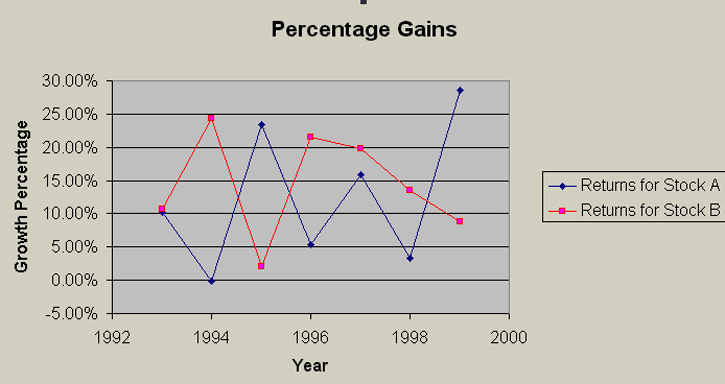
You should get a chart that looks like the following. Make sure to save it into your current spreadsheet. |
|
Notice that these stocks tend to work in opposite directions. When one is having a good year, the other is not. This will be important in what occurs next. You need to work through the following steps.
Now the spreadsheet should look like the following. |
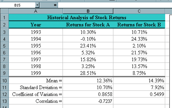
| Notice that the correlation is negative and close to -1
which implies the stocks grow counter to each other. Correlation
does not imply there is a causal relationship. This can be quite a
sticky issue and often causes confusion even in "scientific"
circles. The stocks'
performances may or may not be causally connected.
For example the stocks could be from different market sectors where one of them typically improves when interest rates lower and the other gets worse when interest rates lower. It is even more likely that there is no common underlying cause. In general, correlations vary from -1 to 1. A correlation of -1 implies they work counter to each other. A correlation of 1 implies they follow each other in the same pattern. A correlation of 0 implies they are unrelated. While numbers in between are most common, the nearer the correlation is to one of these strong indicators the clearer the correlation implies something. Developing the Portfolio Mix. At this point we have two stocks on which to spend our money. We could choose to spend a certain percentage on stock A and the remainder on stock B. The next thing we want to do is to use Excel to see the influence of such a purchase mixture.
This section of the spreadsheet should now look like the following where the bottom three rows correspond to the expectations. Notice how the row of standard deviations almost all improve over what occurs when purchasing a single stock. |
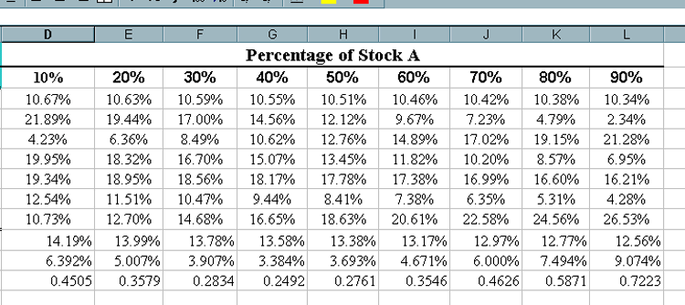
Now we want to chart these percentages for stock A
versus the standard deviations for each mix.
Your chart should look like the following. |
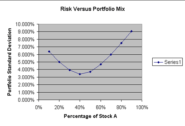
| Notice that the lowest risk or standard deviation occurs when 40% of the money is spent on Stock A. It should be obvious that it is not enough to just diversify. Diversification needs to be done intelligently so as to actually reduce risk. It is also important to remember that a single investor might well diversify too much so that they can not keep up with all of their investments. This is one of many advantages large investment firms have over small investors. They have people that specialize in particular market sectors and people with a huge variety of such specialties. They also are likely to have access to more information to help in determining things such as risk. |